Tuesday, December 9, 2008

Final Map


For my final iI decided to make a map showing both Volkswagen Dealer Locations in the Eastern US, along with the locations of major volkswagen car shows year round.

While looking at maps for the project, and ideas, I realized how many maps are used in advertisement - maps so simple that we sometimes forget they are still maps.

in creating this map, I wanted to resemble the simple style of volkswagen advertisement and mimick their still of ads. The map was kept simple with not much text or objects to dristract, but definetely gets the point across of dealer locations and show locations.

Some VW ads for reference:

http://www.adliterate.com/archives/VW_ThinkSmall.jpg
http://timescorrespondents.typepad.com/charles_bremner/images/2007/11/14/vw4.jpg
http://photo3.bababian.com/upload9/20080528/67B69885B2E3754583135C44697B5EFE.jpg


Links:
forums.vwvortex.com - Enthusiast Site
www.vw.com - VWOA main page
www.volkswagen.com -VW World Site
http://www.edmunds.com/dealerships/Volkswagen/index.html Dealersearch


with border:

Tuesday, November 25, 2008

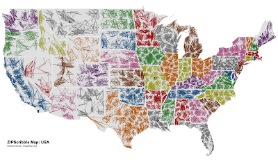
Scribble maps!


This map looked interesting, made up of scribbles, not sure what grouping in scribbles mean. PLUS COLOR!

Tuesday, November 11, 2008

Finally some colors


Edited lab 7, pretty straightforward and a simple touch of color spruce up the map just a bit.

Print vs. Web-

When comparing the print version with the web version, you can def see the variations in color.
-Although I did create a black background map (the printer will hate me for it), I was surprised as to what a good job the printer in RA113 did.
-In terms of colors, the dark reds seem darker in print and more vibrant on web version.
-The lighter colors also have more depth to them in the online version as the printer can't capture all the exact colors as AI can.

Tuesday, November 4, 2008


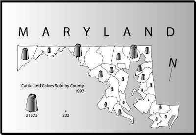
Symbol Maps!!!

We need more cow bell!!!!

Saturday, November 1, 2008

Tuesday, October 21, 2008

Irish Population In West Virginia


Dot density maps. not too fun to make.

Tuesday, September 30, 2008

Lab 05 - Boundary Files

Finished this lab after the exam on Tuesday.

While playing with the counties map and states map, i noticed that the actual state boundaries don't match up with the counties boundaries....i wonder where i went wrong..shall keep playing around to see if anything changes...

as for now:
Lab 5.

oh yea....still missing scale....will think of it shortly.....

Monday, September 29, 2008

Lab 04 - Typography


So, i couldnt find the lab paper professor Halden had given us with the map with the fonts already on it, and it wasnt available online, so i used a combination of all of your (student) maps to try to recreate it...i know i put it somewhere.....if only....

Tuesday, September 23, 2008

Campus Maps


Another interesting map. While in Chicago i was visiting my girlfriend at NIU and thought their campus map was intersting.

ChiTown - and Typography

I was in Chicago for the weekend; i sat at the train station looking at the Metra map and found them interesting.

The map uses a nice selection of typography tricks. One of the main things in graphic design and typography (one of my hobbies) is to use fonts which are either the same, or obviously different. Mixing fonts that are too similar cause the reader to not be sure if they are really different, or if it was done on mistake.

The type used makes the map look very modern, combination of maps and thicknesses make you understand whats what.

Tuesday, September 9, 2008

Intro to Illustrator - Lab 2


Drawing Spheres, Geoids, Ellipsoids and Natural Surfaces, all in shades of gray

Another test :: Go@Blogger.com

Just testing out the mobile blogging feature from cellphones. Works, Ignore :-)

Blogging the world

woooooooo yay maps. end.